Here is my poster for my font
The poster i create to present my font that called "YU-NIQE" that really represent the font it self that shape into different unique shape.

This is my reference picture of tools
We offer a range of specialized services tailored to meet your individual needs. Our approach is focused on understanding and responding to what you require, providing effective and practical solutions.

A
CLOTHES TIGHTENERS

B
SPONGE

C
BALLON PIECE

D
WALLET

E
IRON FENCE

F
GRIPER

G
LAMP

H
IRON GATE

I
PEN
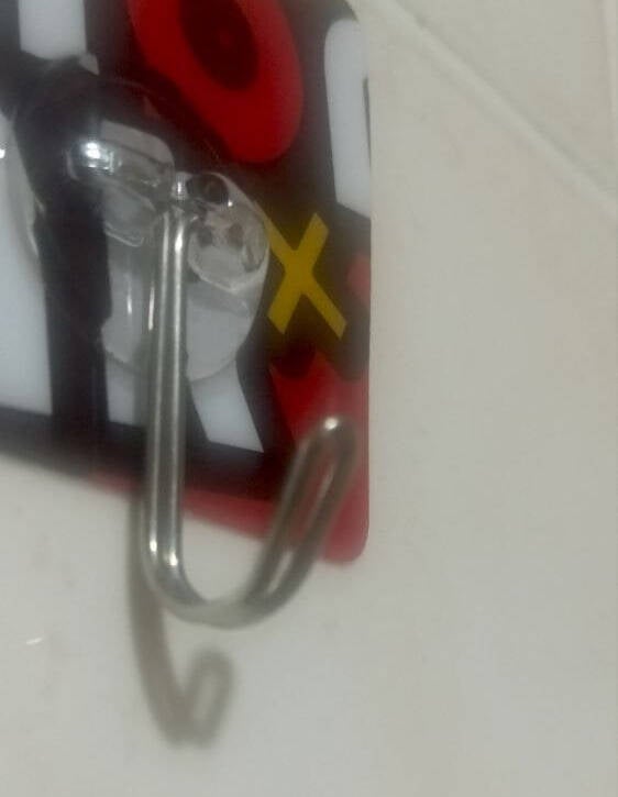
J
OBJECT HOLDER

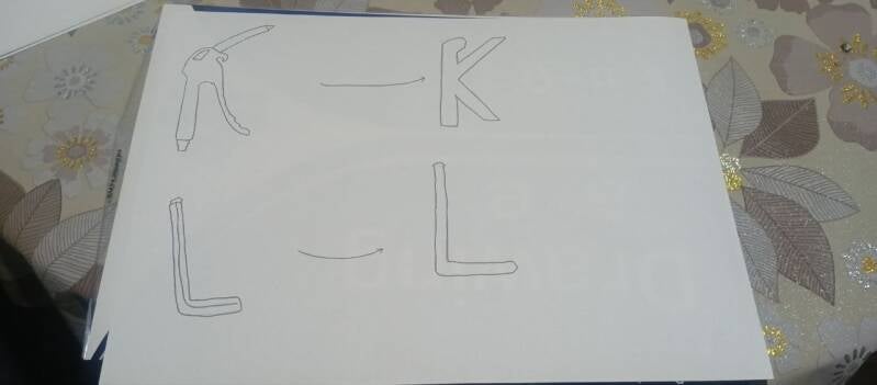
K
AIR GUN

L
L WRENCE

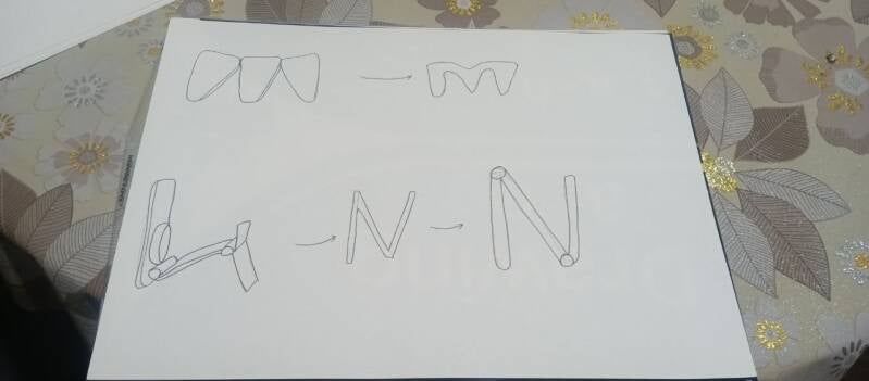
M
ERASER

N
PHONE HOLDER

O
BISSCUIT

P
MOSQUITO VAPORIZER

Q
PAN

R
STAPLE GUN
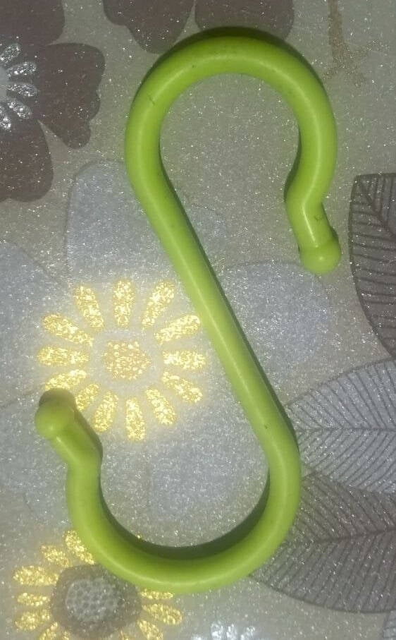
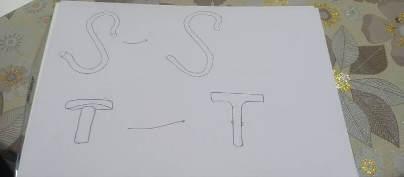
S
CLOTHE HOLDER

T
SILINER HOLDER

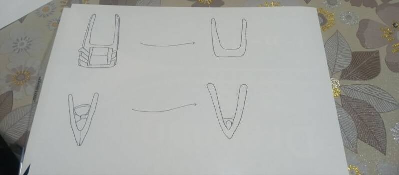
U
PLASTIC CUTTTER
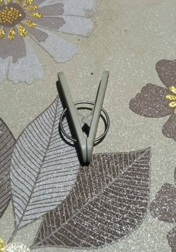
V
CLOTHES TIGHTENERS

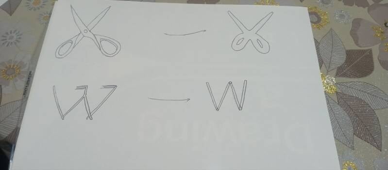
W
SUSPENSION
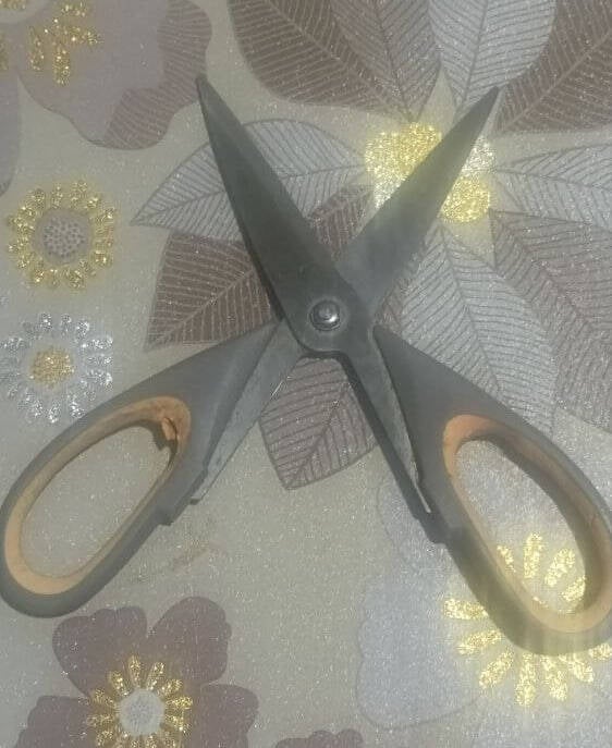
X
SCISSORS
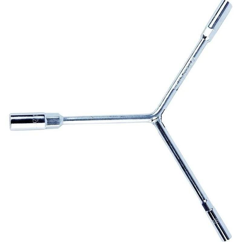
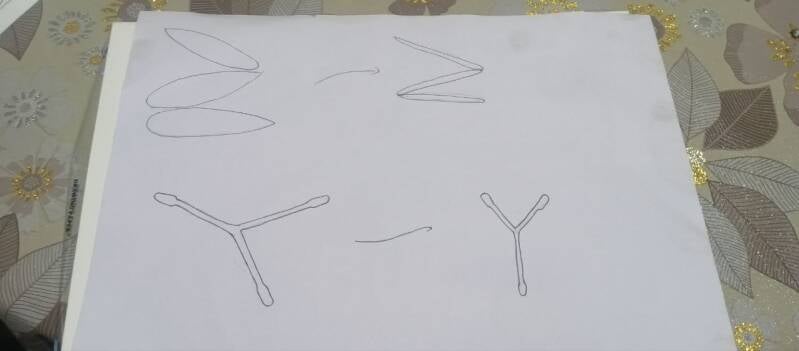
Y
Y SHAPE SPANA

Z
FREEZER MAGNET
MY FONT TEMPLATE
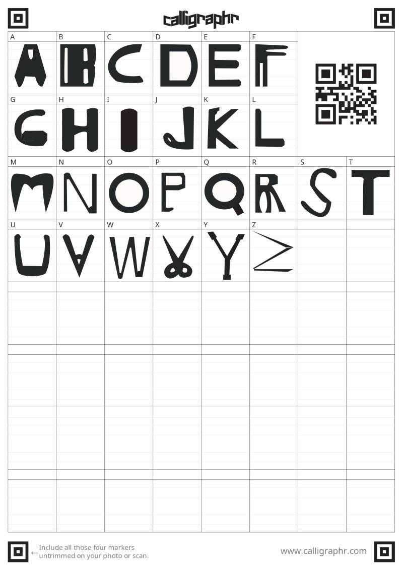
https://fileport.io/dSFnSKay2ema
Miss can copy the link and paste to google tab to donload font it only available for 7 day.
Miss can donload or screenshot the template to put it in chaligrapher.
Designer's Reflection
This project helped me look at everyday objects in a completely different way. My task was to create a typeface by finding objects that naturally looked like the letters A–Z. To do this, I explored places around me such as my home, shops, supermarkets, and public areas. I paid attention to the shapes of products, tools, packaging, and household items. Instead of seeing them only as objects, I started looking at them as possible letters.
The most interesting part of the process was discovering how many letterforms already exist in daily life. At first, I thought finding all 26 letters would be very difficult. However, as I continued searching, I began noticing letters almost everywhere. Some letters were easy to find because their shapes are common in products and objects. Others were much harder and required more creativity and patience. For example, I found a clothes peg that looked like the letter “A,” while other objects naturally formed different letters. This experience taught me to observe my surroundings more carefully and think more creatively.
One challenge was maintaining visual consistency across the alphabet because every letter came from a different object. To make the typeface feel more unified, I edited all the photographs using a similar style. I adjusted the size, position, brightness, and contrast of each image so that the letters looked balanced when placed together. I also used a consistent presentation style to help create a stronger connection between all 26 letters. Even though the objects were different, these design choices helped them work together as one typeface.
Throughout the project, I also learned more about type anatomy. Several anatomical features can be seen in my font. The stem is the main vertical stroke found in letters such as A and T. The bowl is the rounded part seen in letters like B and P. The counter is the space inside a letter, such as the opening inside A or B. The crossbar is the horizontal stroke that connects parts of a letter, especially visible in A. Another feature is the terminal, which is the end of a stroke in letters such as C or S. Understanding these features helped me recognise what makes a shape look like a letter.
If I had more time, I would search for even more unique objects and improve the editing process to make the typeface more consistent. I would also like to create lowercase letters, numbers, and symbols to make the font more complete. Overall, this project improved my creativity, observation skills, and understanding of typography by showing me that letters can be found almost anywhere around us.
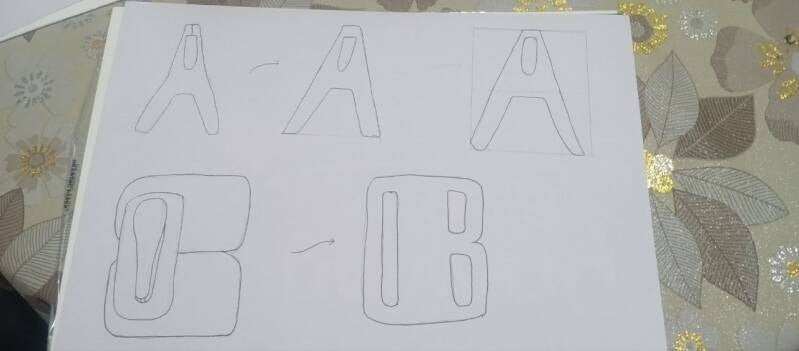
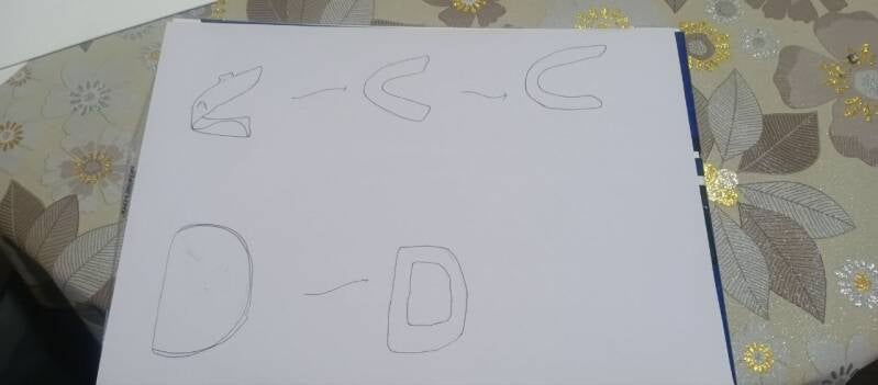
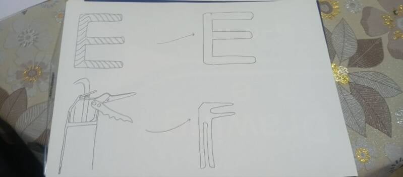
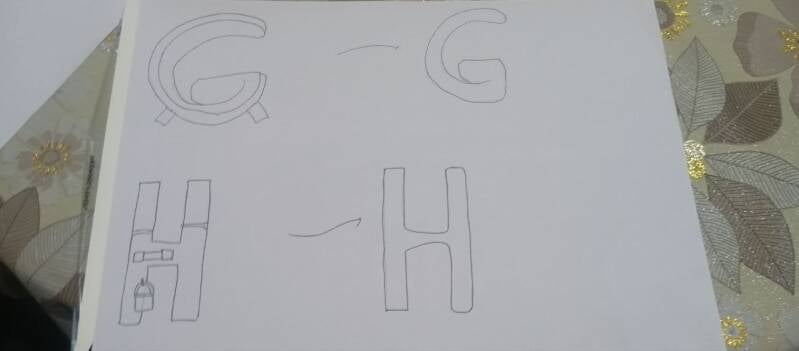
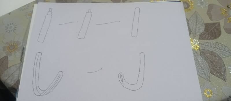
MY IDEA DEVLOPMENT

Create Your Own Website With Webador